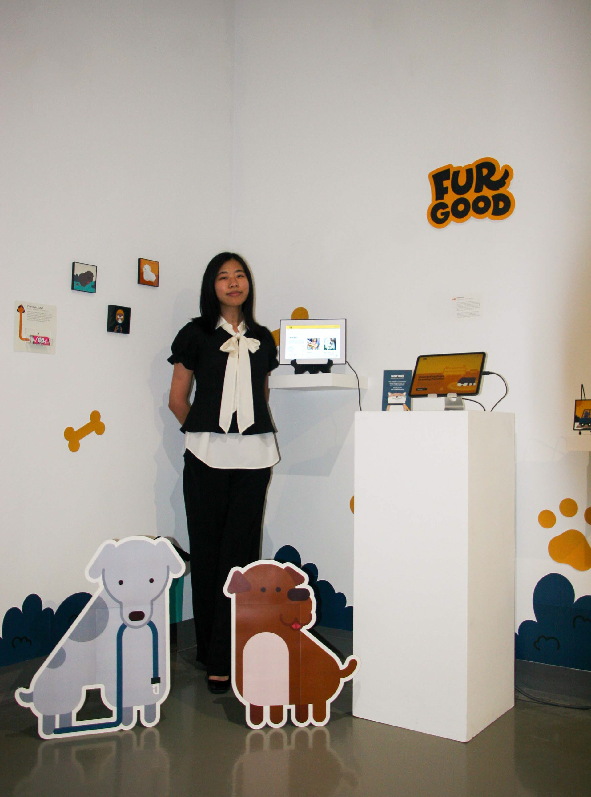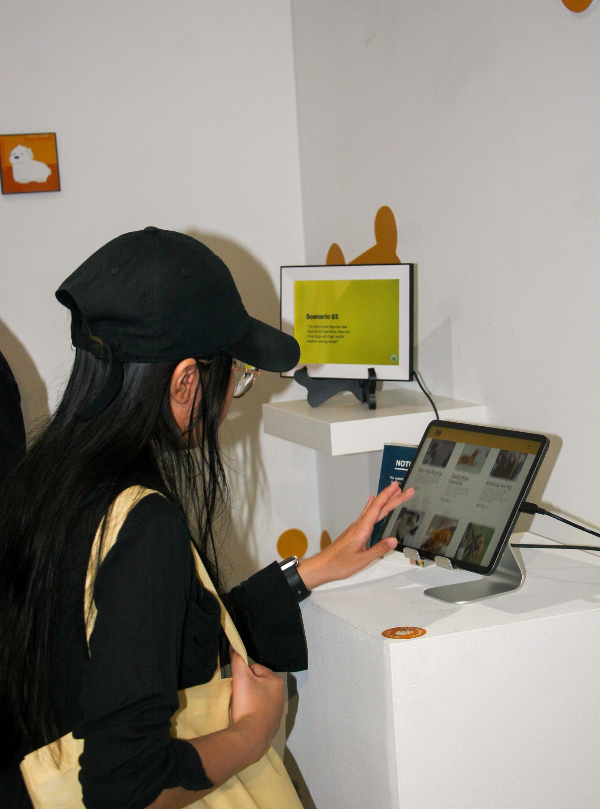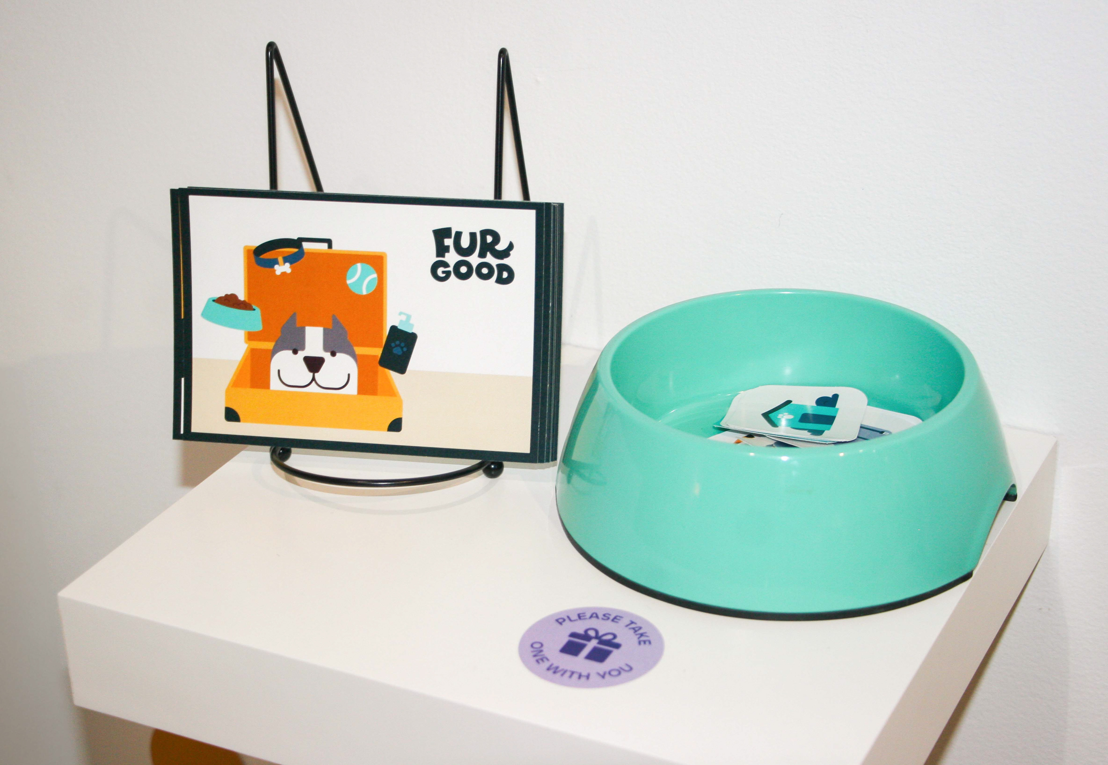
FURGOOD
UX/UI Design
Illustrator ● After Effects ● Figma
Illustrator ● After Effects ● Figma
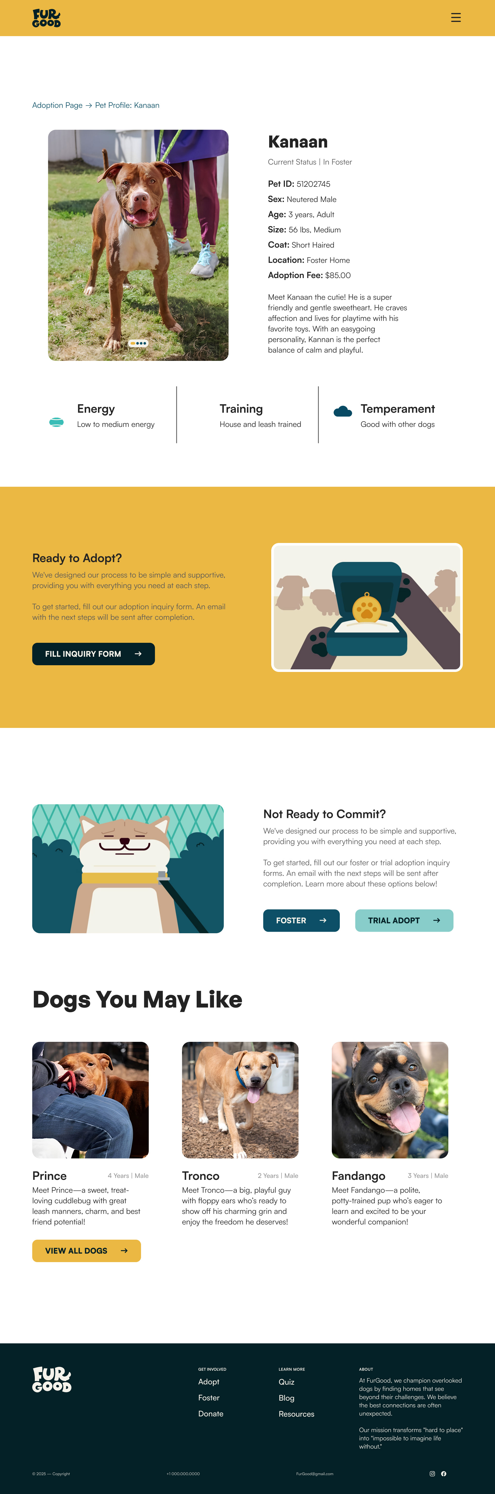
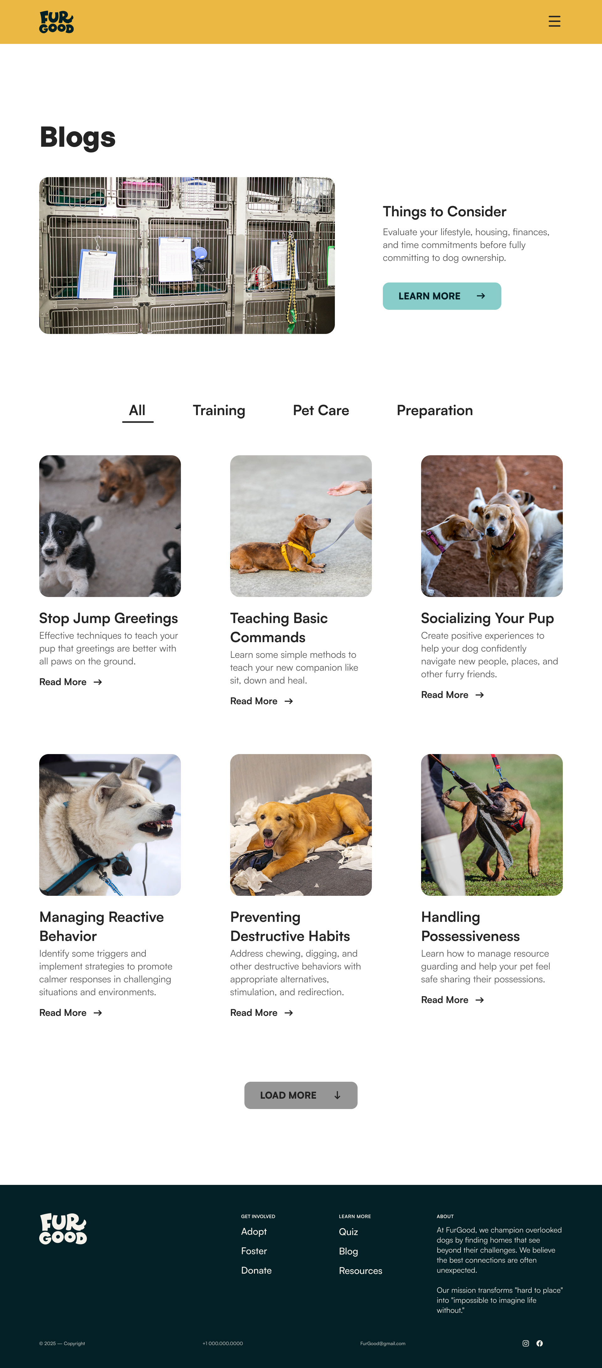
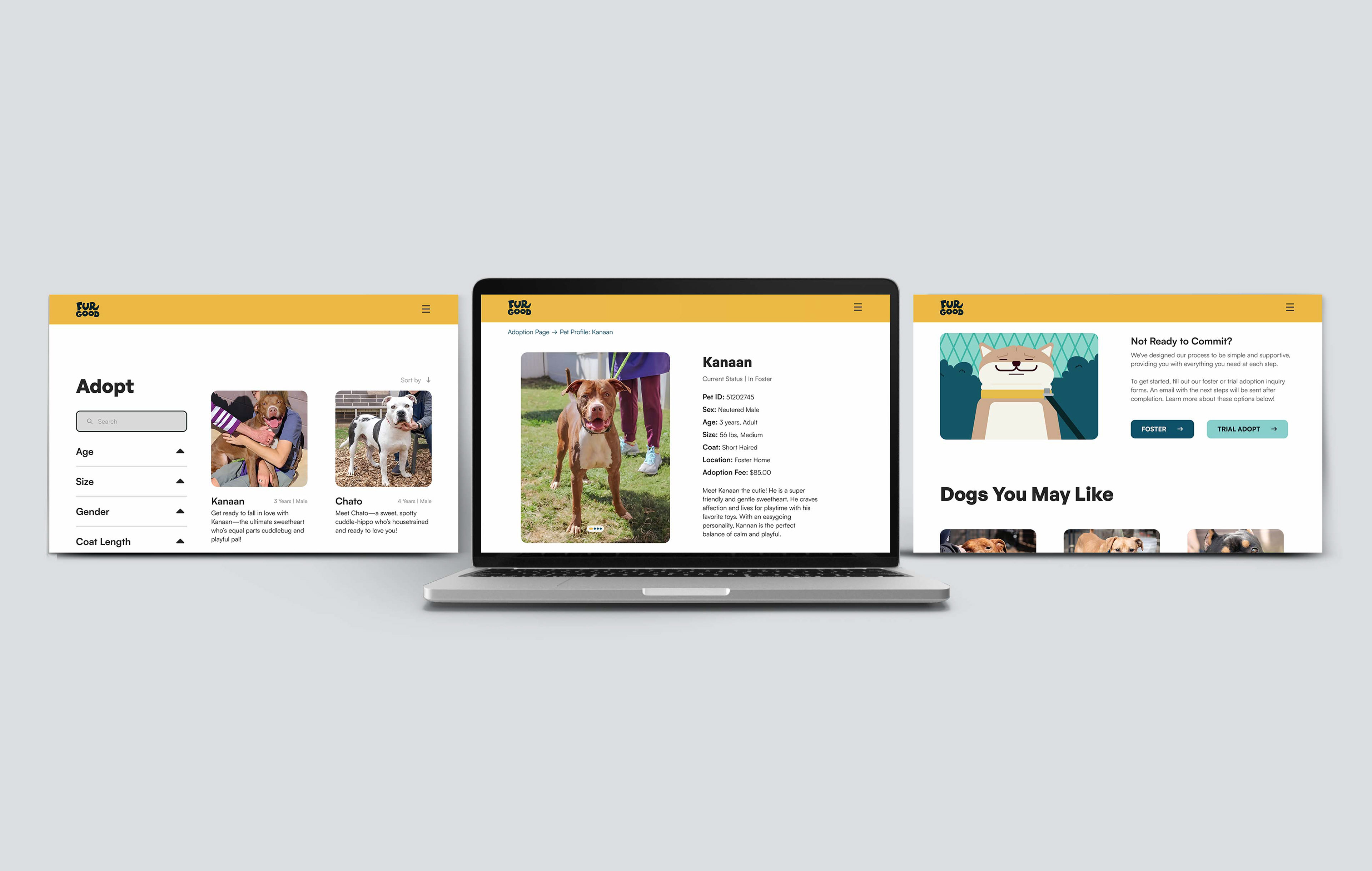
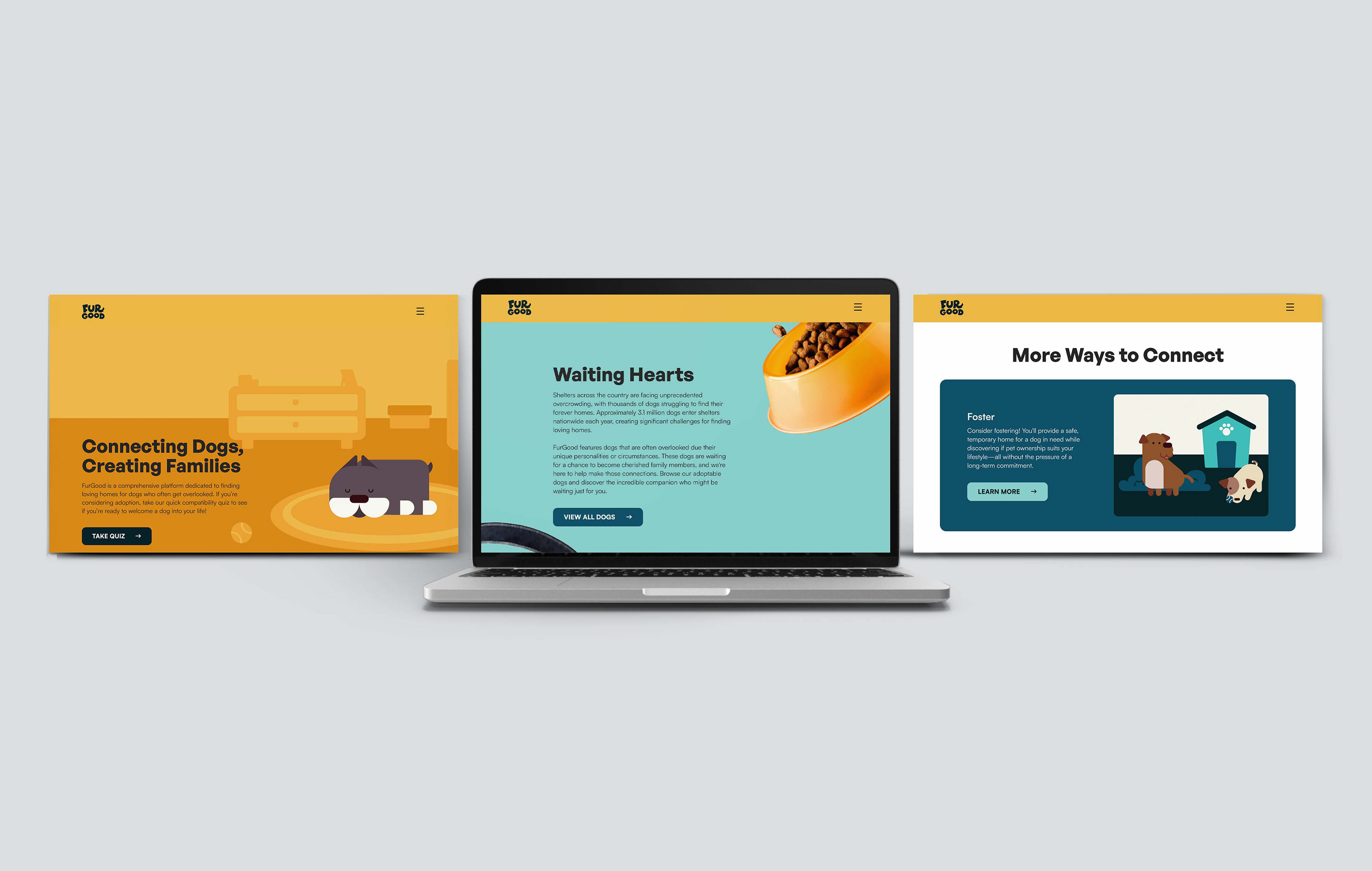
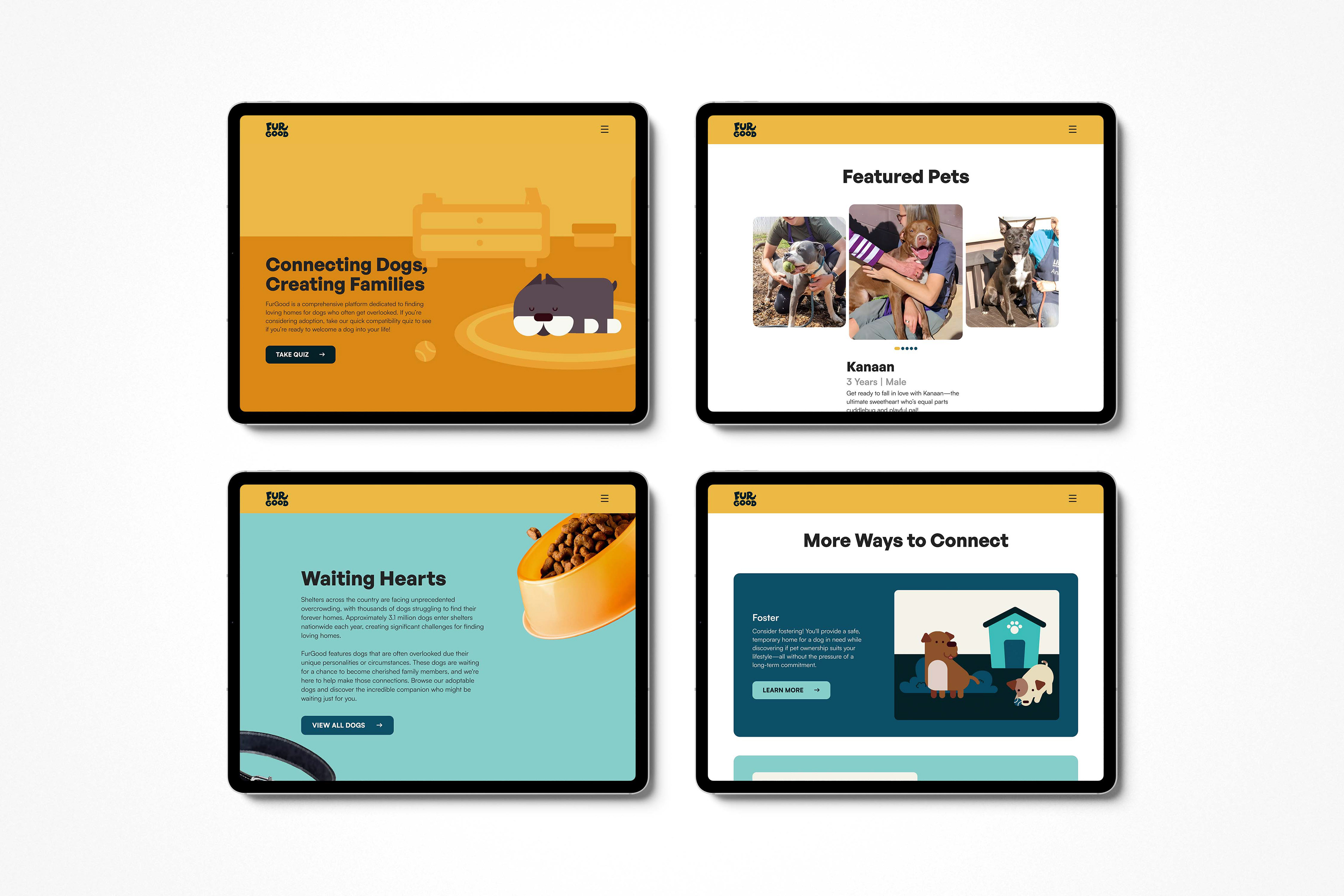
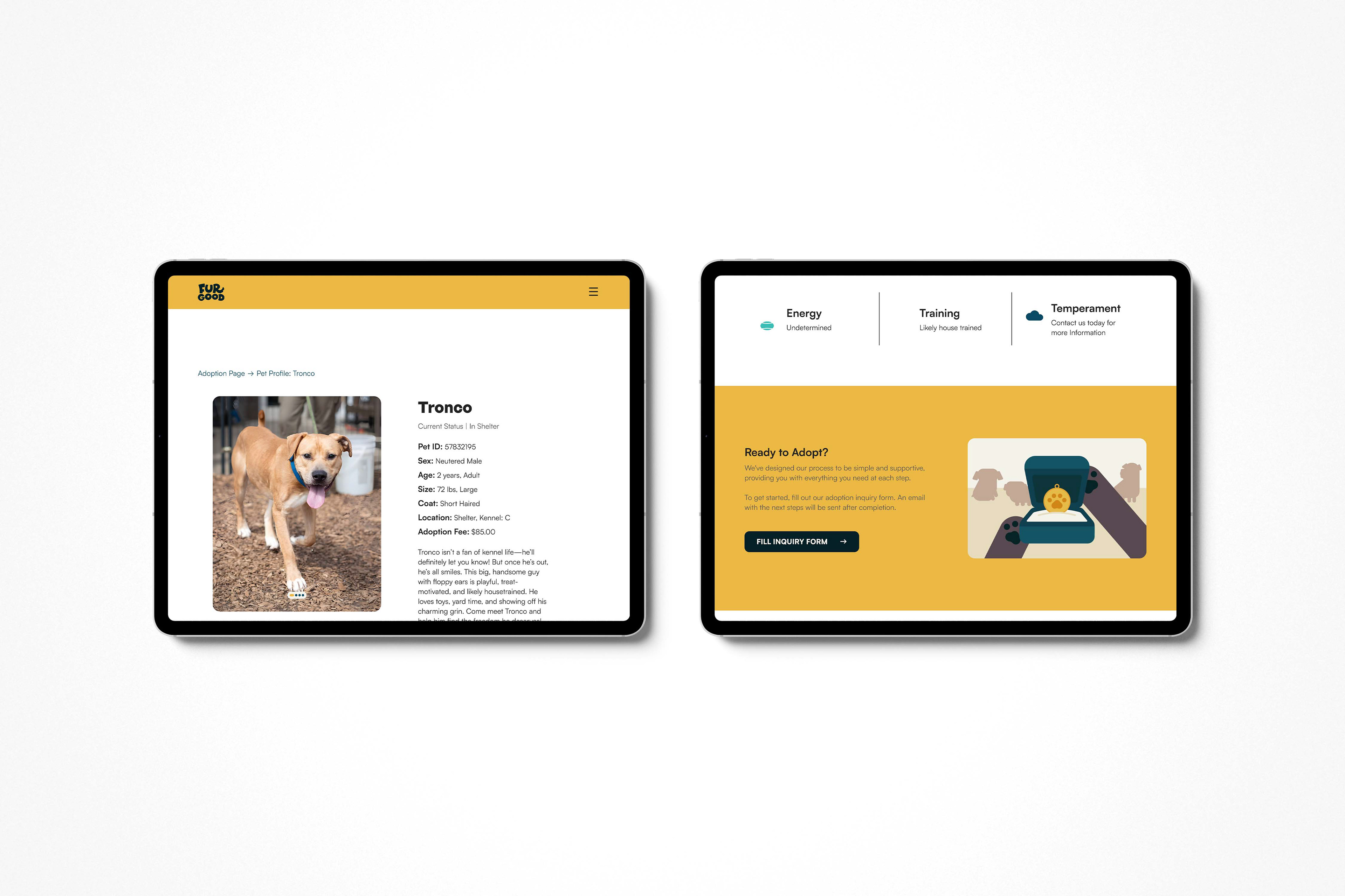
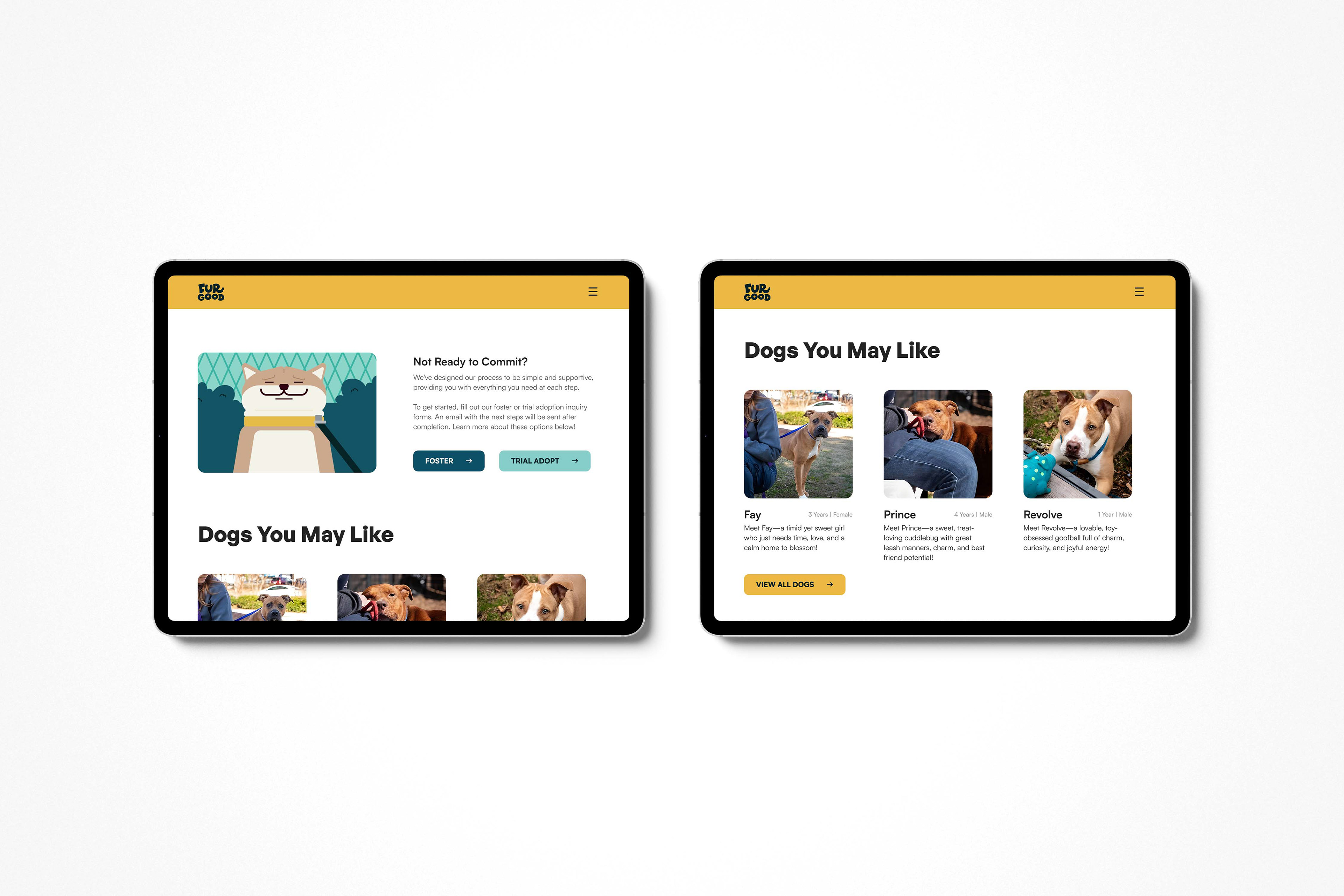
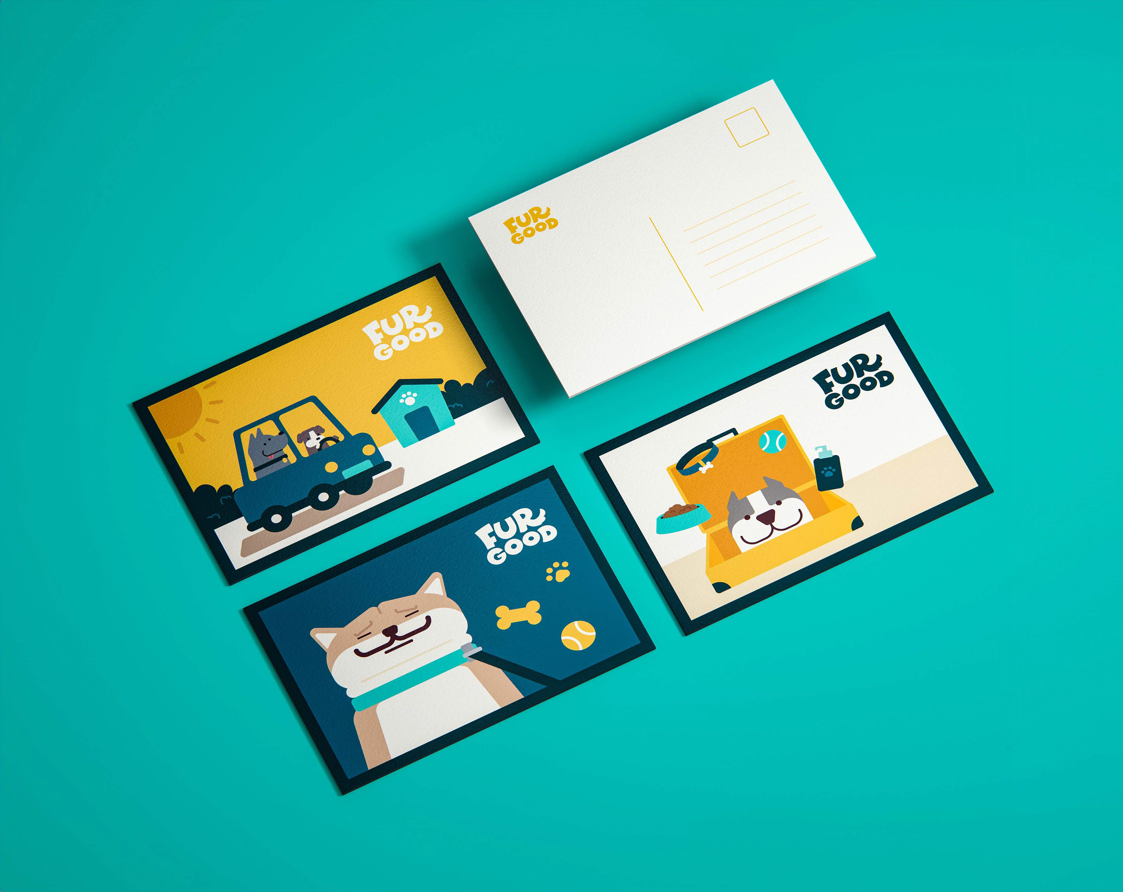
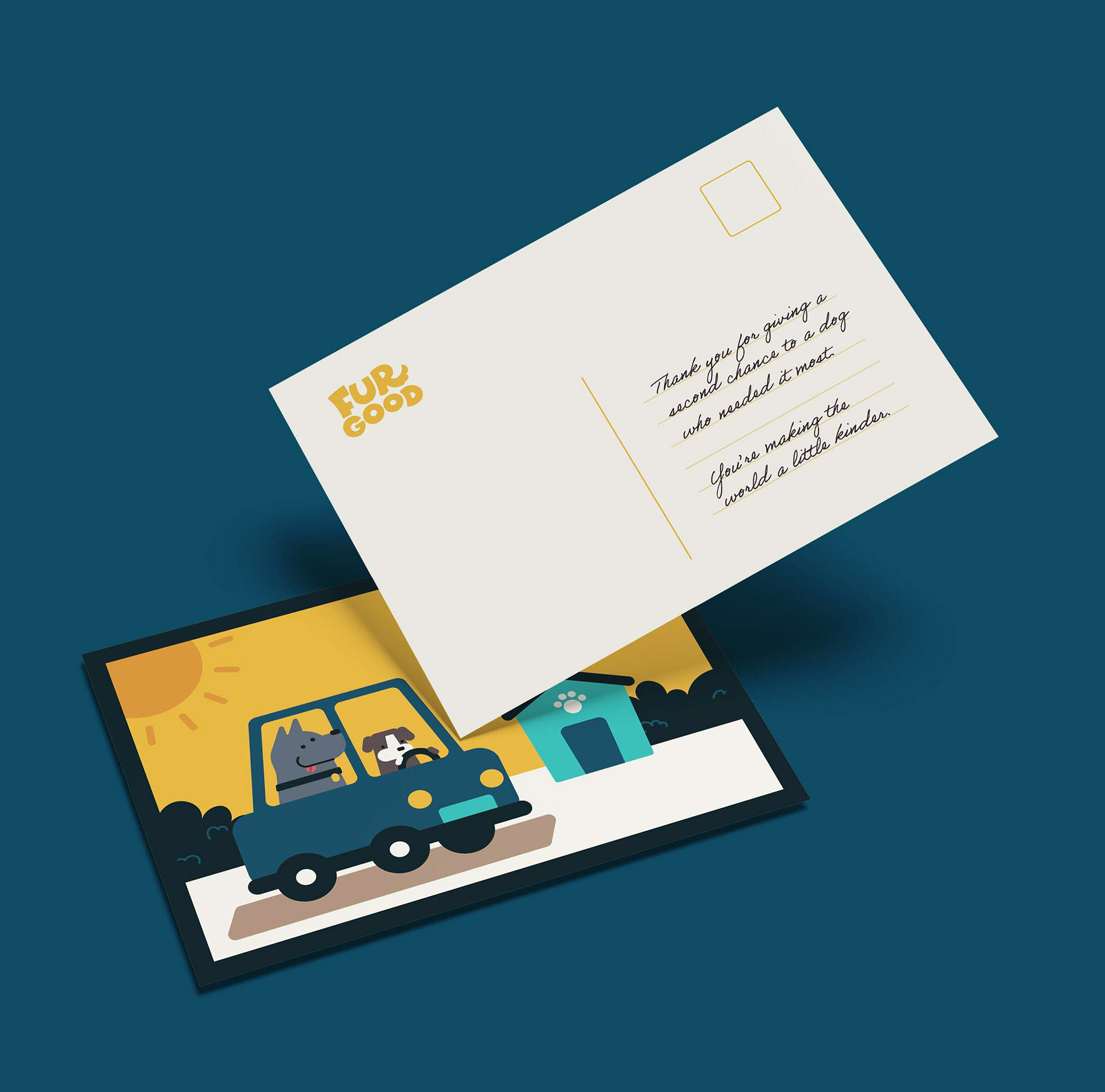
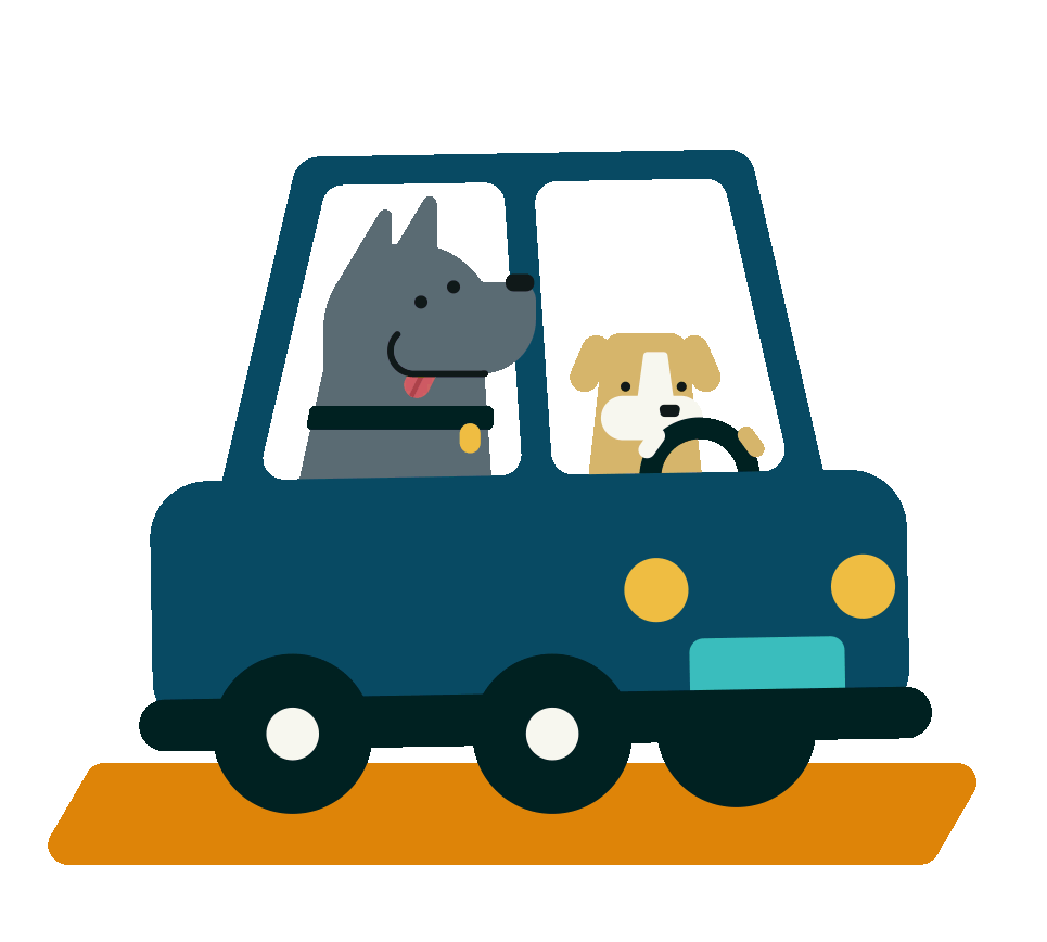
Designed to address the issue of overcrowded dog shelters, this website spotlights hard-to-place and at-risk dogs while reducing return rates through accessible educational resources. Playful motion graphics and a warm color palette create an inviting user experience, demonstrating how thoughtful digital design can tackle real-world social challenges.
Research for this project was conducted in collaboration with LifeLine Animal Project’s DeKalb County shelter via surveys, staff interviews, and website and social media analysis.
Learn more about about the adoptable dogs at LifeLine's Website and follow them on Instagram!
Research for this project was conducted in collaboration with LifeLine Animal Project’s DeKalb County shelter via surveys, staff interviews, and website and social media analysis.
Learn more about about the adoptable dogs at LifeLine's Website and follow them on Instagram!
Research
What's the issue?
Shelters are overcrowded, not just from too many dogs but from which dogs get overlooked, how prepared adopters are and the synergy between owner and pet.
Going Unnoticed
Certain dogs — older, larger, "less adoptable" breeds, or dogs with a longer shelter stay — get passed over again and again, lingering in shelters far longer than others and driving up capacity.


High Return Rates
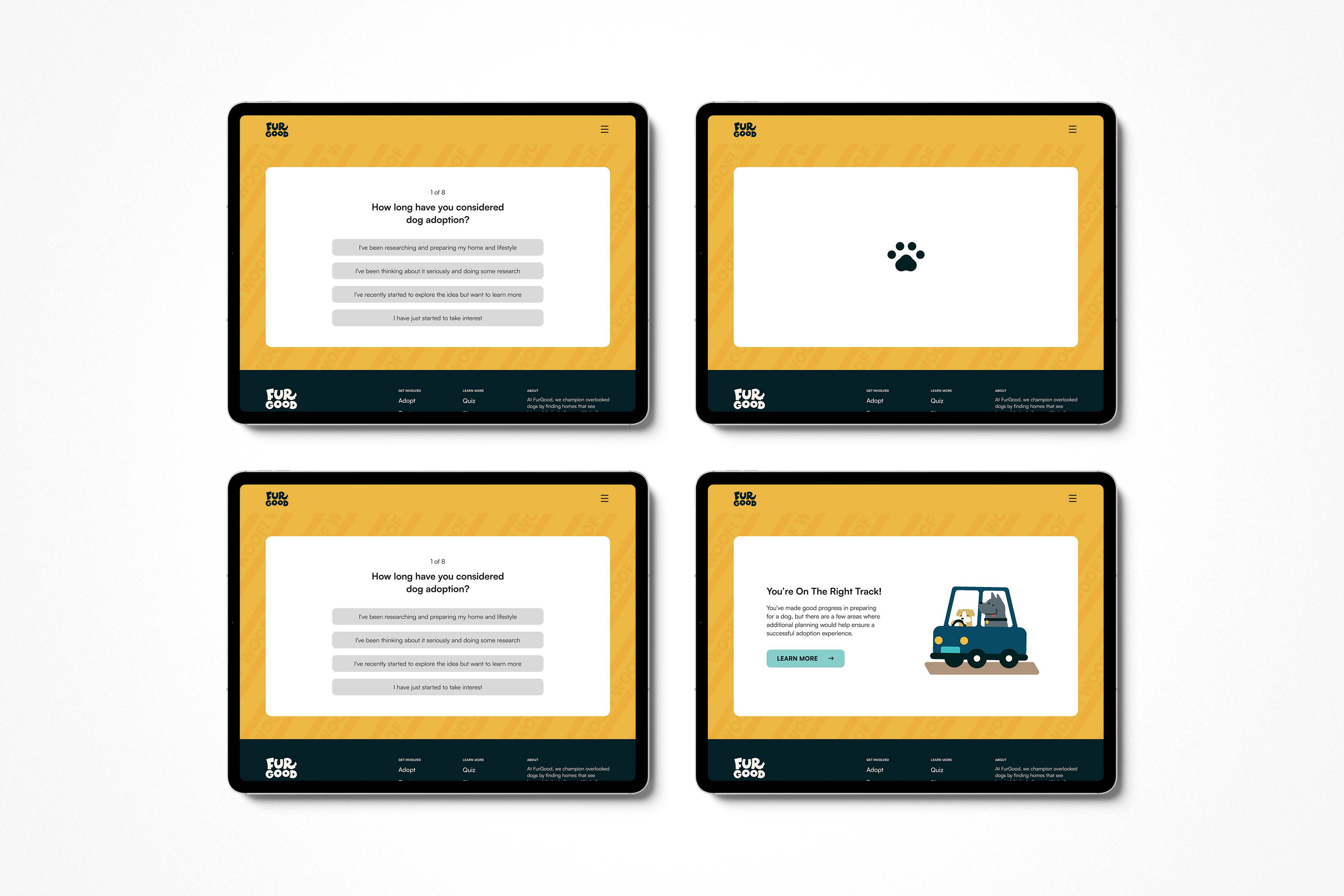
Many adopters aren't equipped with the knowledge to handle behavioral or lifestyle challenges after adoption, leading to a cycle of dogs being returned and re-entering the system.
Poor Matching
Without guidance, adopters often choose based on appearance alone, resulting in mismatches between a dog's needs/temperament and an adopter's lifestyle which leads to returns.
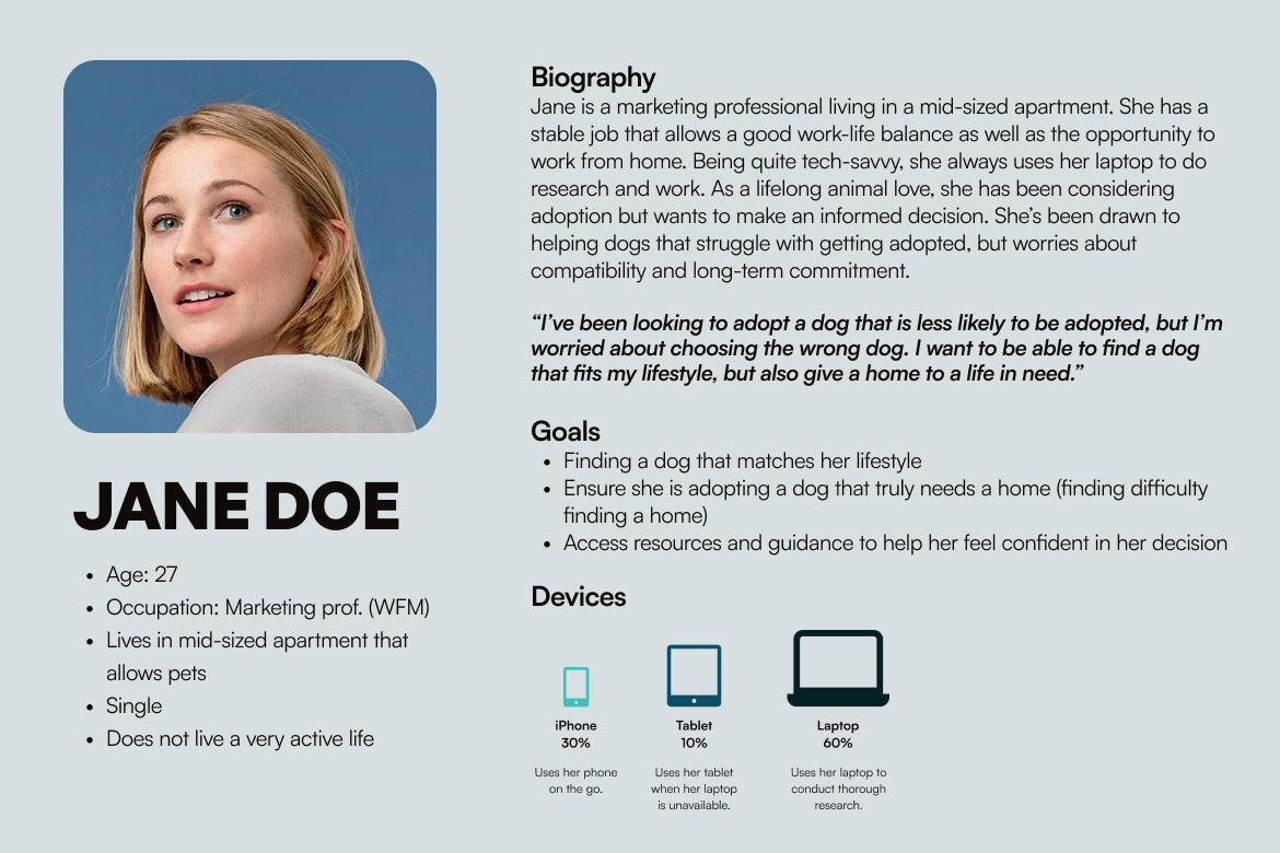
01. User persona
To better understand the website needs, I surveyed prospective adopters, previous pet owners and shelter staff. As a result, I learned of common motivations, hesitations and pain points across the adoption journey shaping the persona on the left.
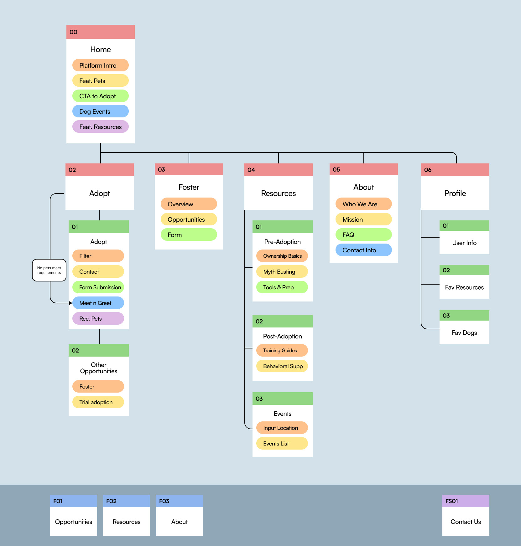
02. Site Map
I structured the sitemap around five core sections: Adoption, Foster, Resources, About and Profile. It keeps key actions easy to find, reducing the number of clicks needed to reach them.
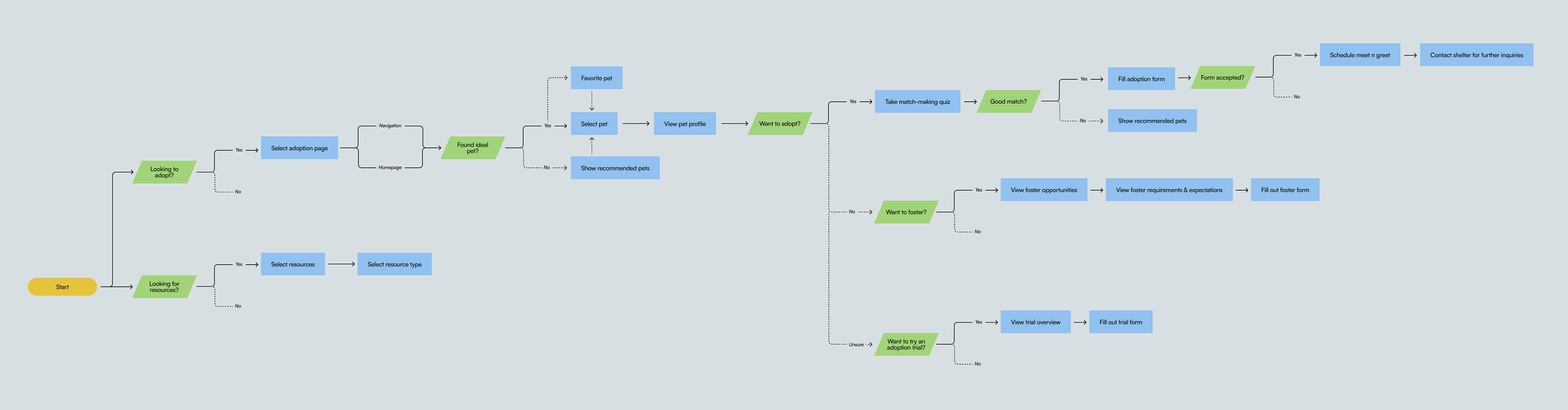
03. User Flow
I structured the sitemap around five core sections: Adoption, Foster, Resources, About and Profile. It keeps key actions easy to find, reducing the number of clicks needed to reach them.
Execution
low fidelity wireframes
I created low-fidelity wireframes to map out the site's layout and structure before adding visual design, focusing on content hierarchy and usability.